
[pt - br]
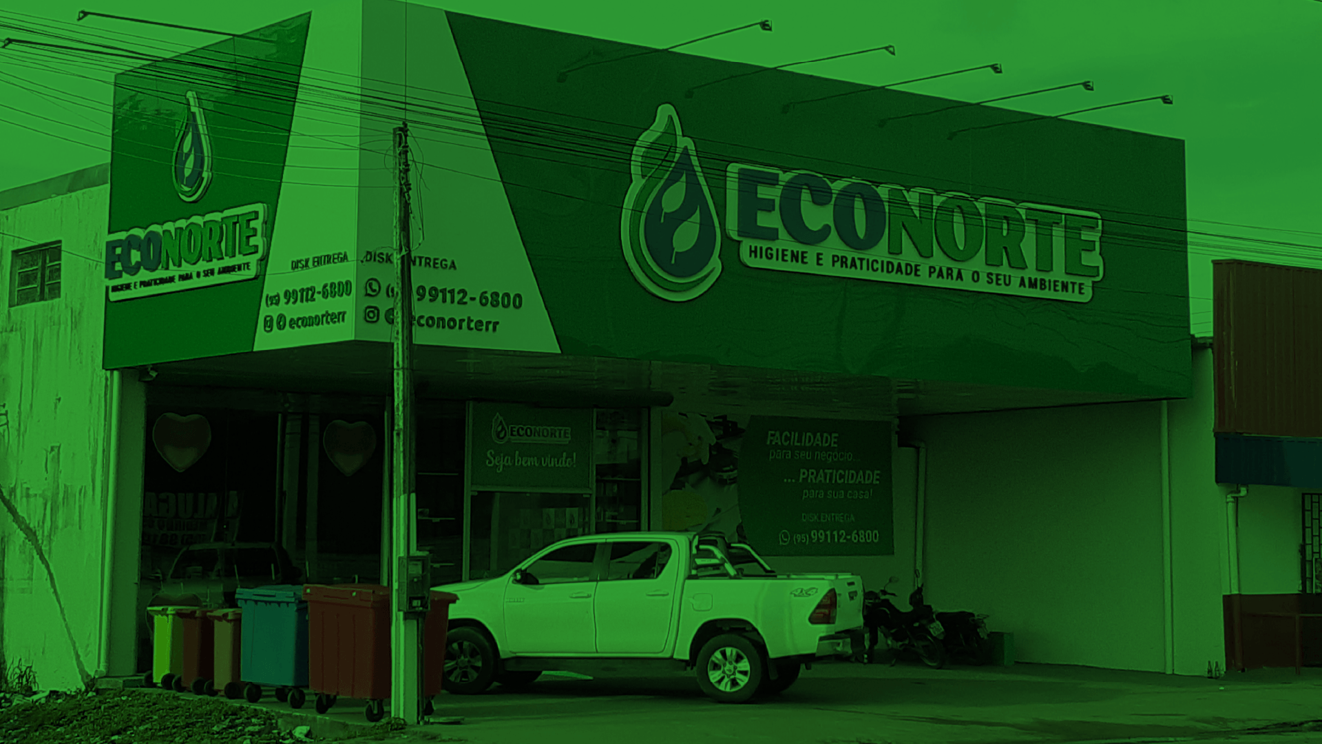
Passei é um curso preparatório com sede em Nova Iguaçu, Rio de Janeiro.
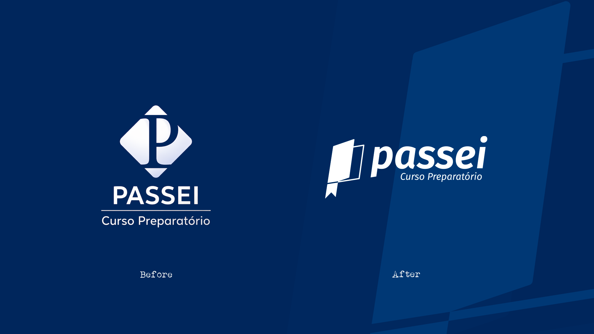
Após uma consultoria de marca, concluiu-se que a antiga identidade visual não refletia mais os valores que a marca desejava transmitir.
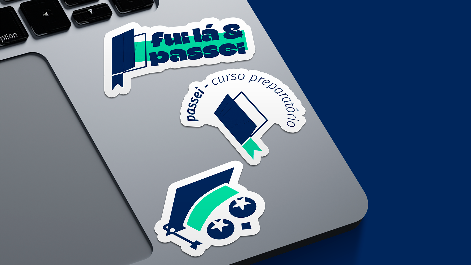
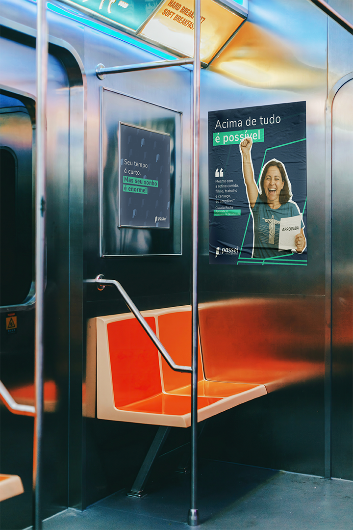
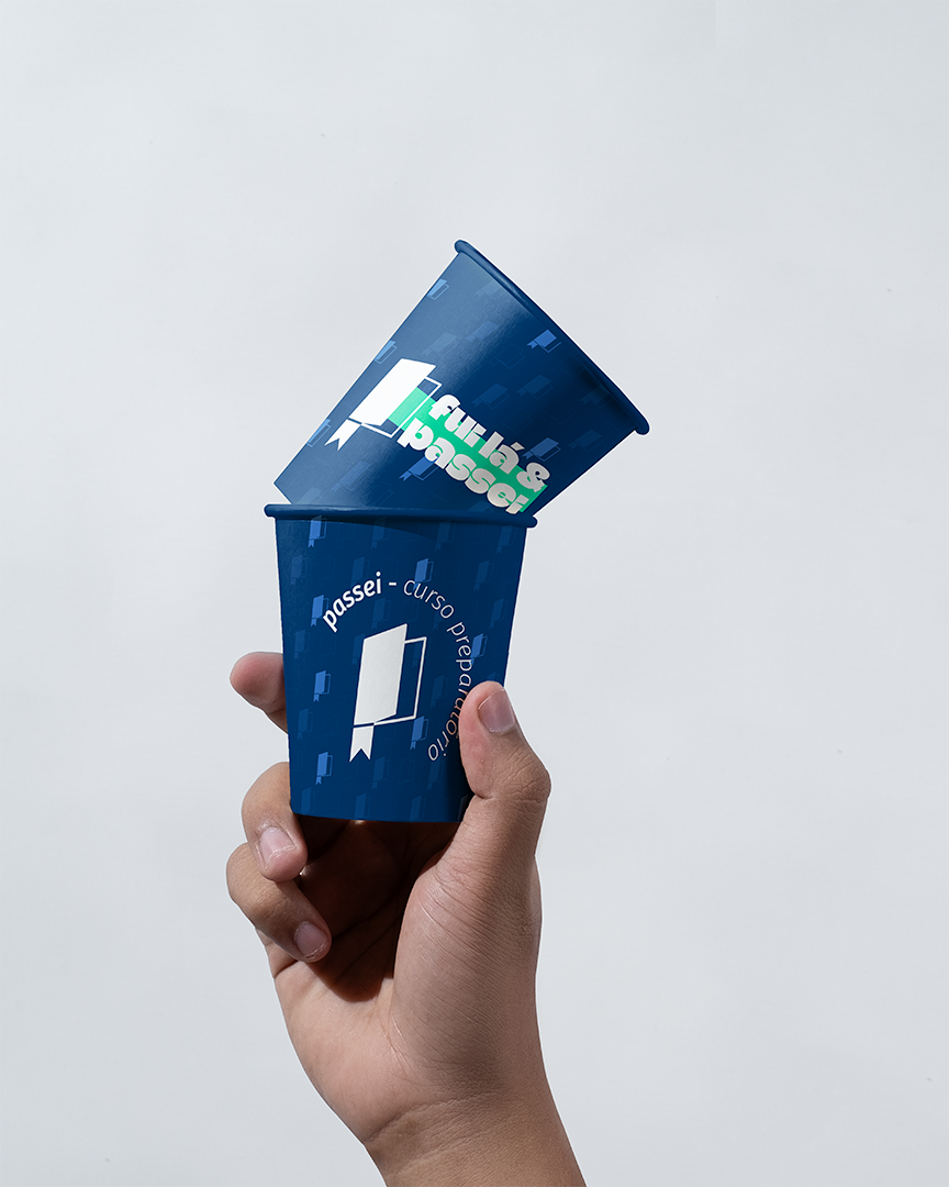
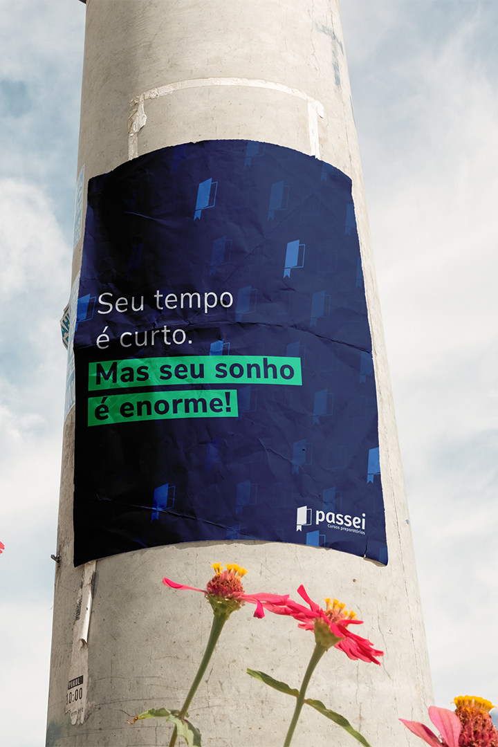
A partir daí, foi desenvolvida uma nova identidade visual que trouxe clareza, cores e ícones próprios. Além disso, reforçou o profissionalismo, a leveza e o ambiente acolhedor que a marca deseja que seu público perceba.
Cliente: PASSEI CURSO PREPARATÓRIO
Projeto: Identidade Visual
Ano: 2025
[eng - usa]
Passei is a preparatory course based in Nova Iguaçu, Rio de Janeiro.
Following a brand consultancy, it was concluded that the old visual identity no longer reflected the values the brand wished to convey.
From there, a new visual identity was developed that brought clarity, colors, and unique icons. Furthermore, it reinforced the professionalism, lightness, and welcoming environment that the brand wants its audience to perceive.
Client: PASSEI CURSO PREPARATÓRIO
Project: Visual Identity
Year: 2025

[pt - br]
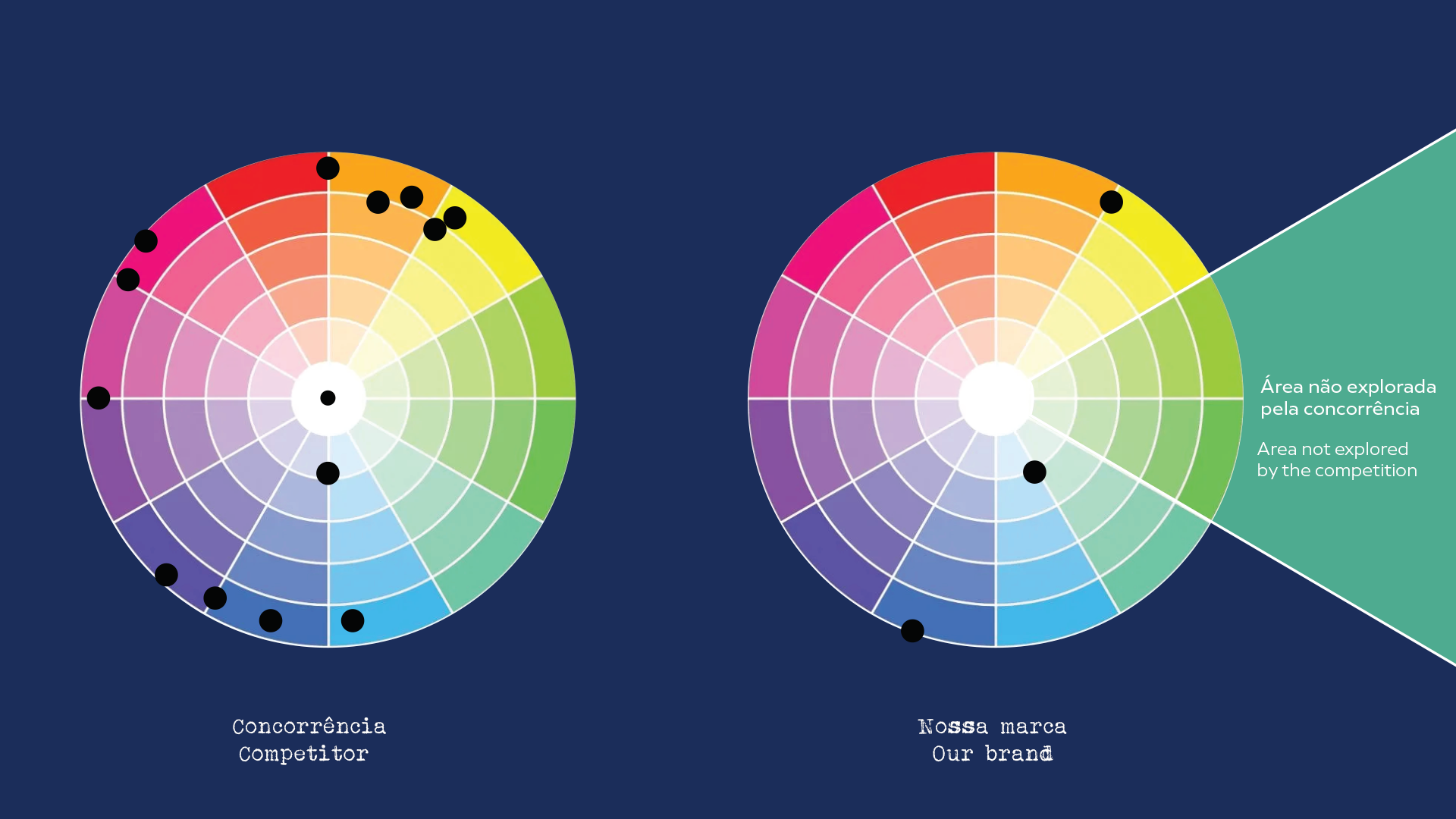
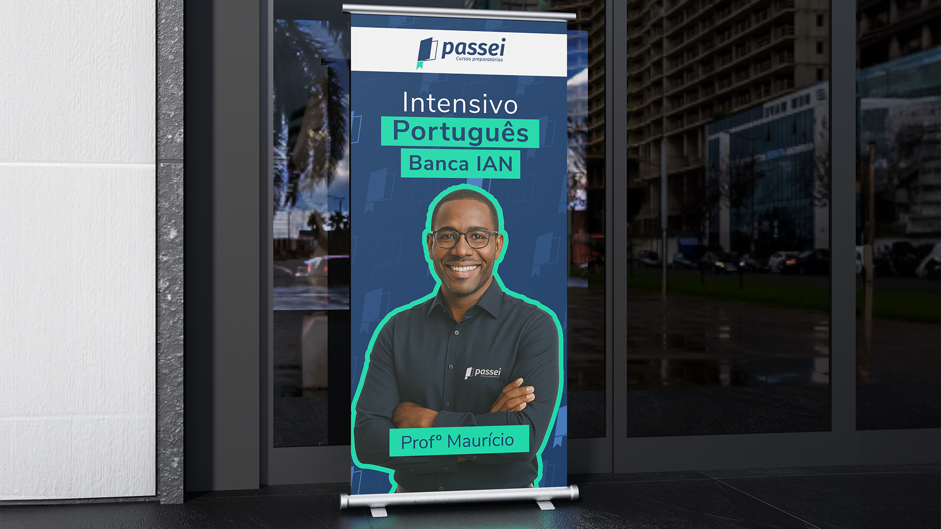
Um ponto que consideramos importantes foi manter a cor, uma vez que ela já acompanhava a marca ao longo dos anos.
Apenas uma tonalidade de cor de destaque foi alterada, uma vez que, depois de analisar a concorrência identificamos que a cor de destaque que nossa marca usava já era amplamente exploradas por outras empresas do mesmo seguimento.
Então, identificamos uma oportunidade de trabalhar com a cor verde e, desse modo, conseguimos nos diferenciar visualmente.
[eng - usa]
One point we considered important was maintaining the color, since it had been associated with the brand for many years.
Only one accent color shade was changed, because after analyzing the competition we identified that the accent color our brand used was already widely used by other companies in the same sector.
Therefore, we identified an opportunity to work with the color green and, in this way, we were able to differentiate ourselves visually.